
WEB CREATIVES //
WEB CREATIVES //


SUB50
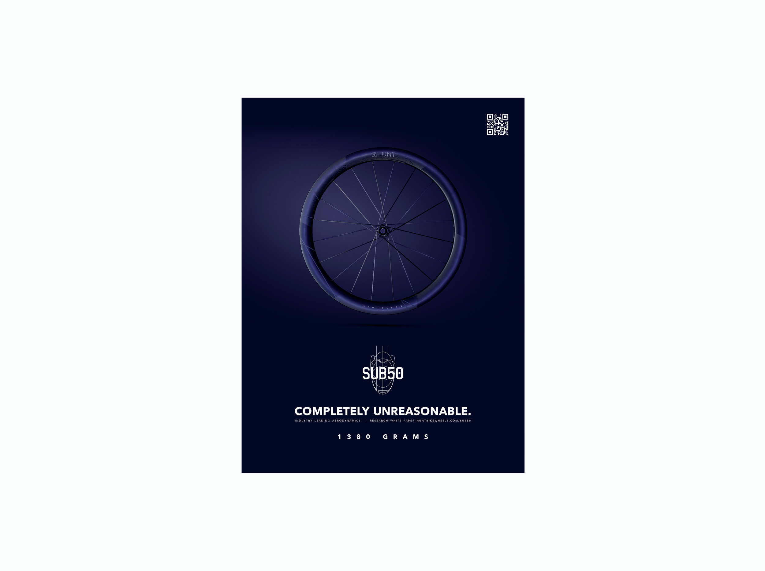
Print AD.
We started by designing the print ad first, using the strongest photography assets to set the visual tone for the entire campaign. The bold layout and colour palette helped define the look and feel, which we then carried through to web, social, and other campaign materials. This approach ensured consistency across all touchpoints while allowing the visuals to lead with real impact.


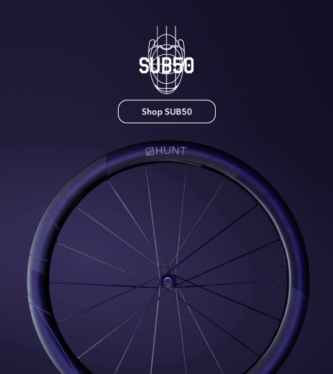
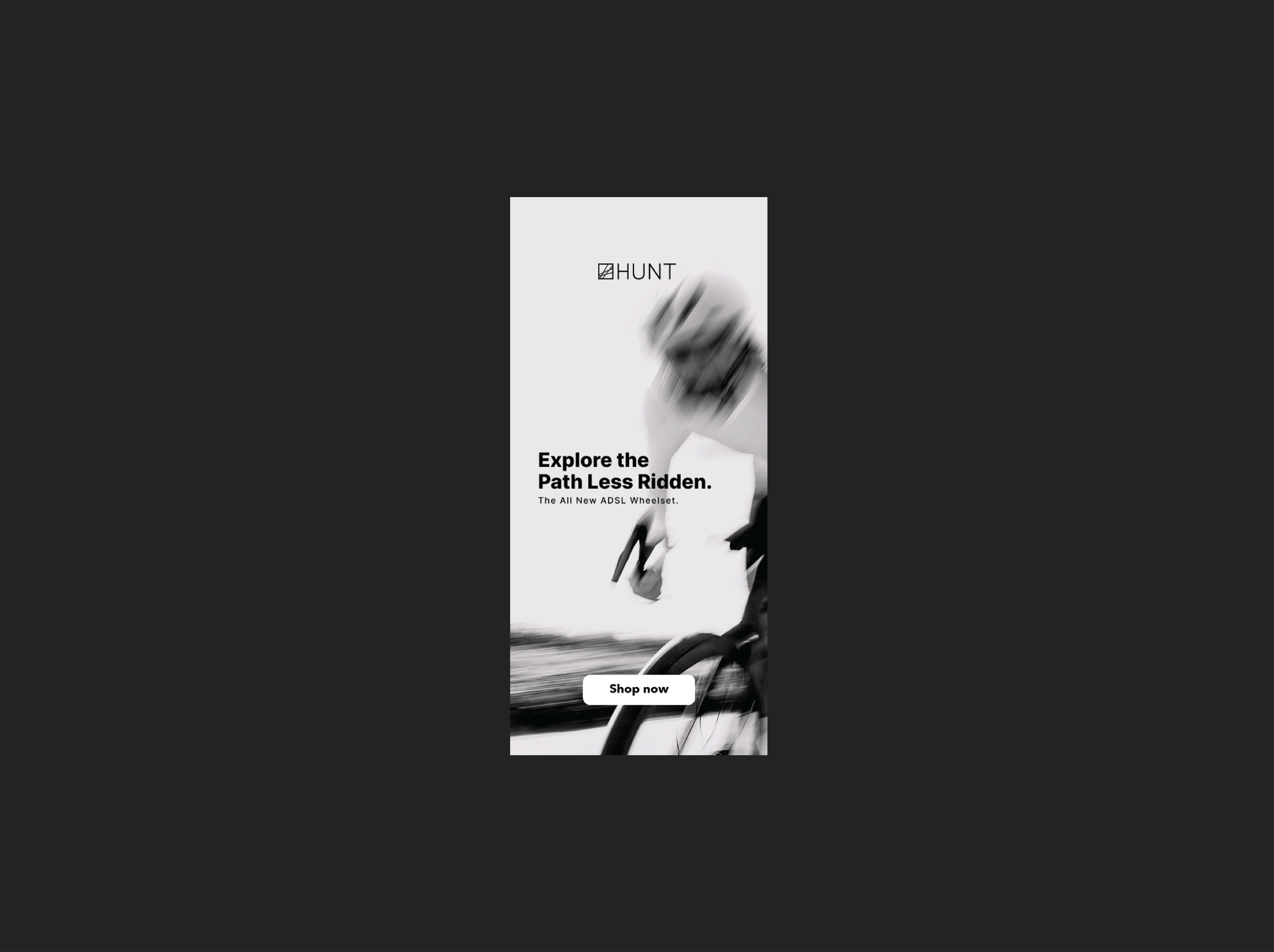
Campaign Visuals.
For the SUB50 campaign, my goal was to create a bold digital presence that felt fast, premium, and impossible to scroll past. I leaned into a rich purple palette to break from the usual cycling industry tones, creating contrast against Hunt’s brand colours and making the visuals instantly pop. Every design decision, from layout to animation, was made to highlight speed and innovation while maintaining a clean, performance-driven aesthetic. The result was a campaign that felt striking and modern, and a product page that held its own in a competitive space.

“The SUB50 represents the pinnacle of our Limitless aero technology, a wheel built to deliver uncompromising speed, control and preformance for serious riders.”
— Hunt Wheels
